The coming of spring begs for new and exciting changes to our home, and what better way to change than to try a new paint color? It’s exciting, engaging, and always interesting to try new paint colors.
Check out our 2017 Paint Color Trends for Spring!
Nature Green
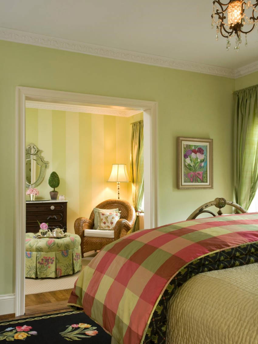
With Greenery being Pantone’s Color of the Year and spring being all about those blooming flowers, it’s no surprise we’re starting with green. This hue presents a calm and comforting vibe, perfect for spring!
Related: Greenery is Pantone’s Color of the Year!
Light Pink Hue
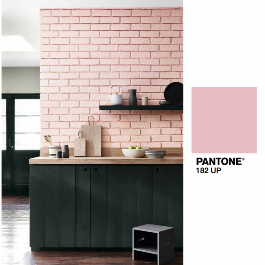
Pink is one of the most famous colors connected to spring, and you can use it in many different ways - pink hues can easily go from natural to extravagant, and you have many options in between. But we like the more natural look!
Stone White
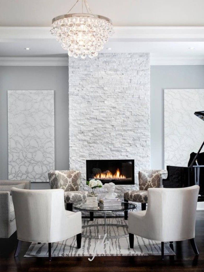
White is great for spacious rooms, and this particular tone of stone white exudes a classy vibe, worthy of royalty!
Related: Beautiful Color Schemes for Greenery!
Creamy Beige
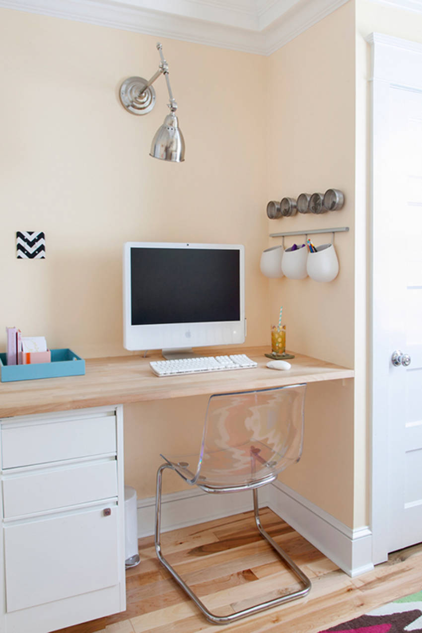
The mother of all natural color tones! You shouldn’t underestimate this creamy beige, it’s more than just a “normal color,” as it can be used to achieve a wonderful effect. Above, you can see how good it looks for a simple workspace - it’s easy on the eyes, but still charming!
Related: Top 10 Paint Color Trends You Need To Try In 2017
Ocean Blue + Orange
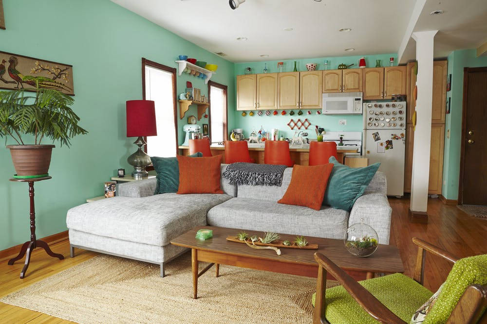
For something a little bolder, you can combine two opposing colors to create contrast. Blue and orange are the most famously abused of all color combinations, but you’ll be a little different if you pick ocean blue and coral orange. That’s how you turn a cliché on its head!
Related: Lots of Pretty Colors and Striped Bedroom Decor
Yellow Walls + Orange Floor
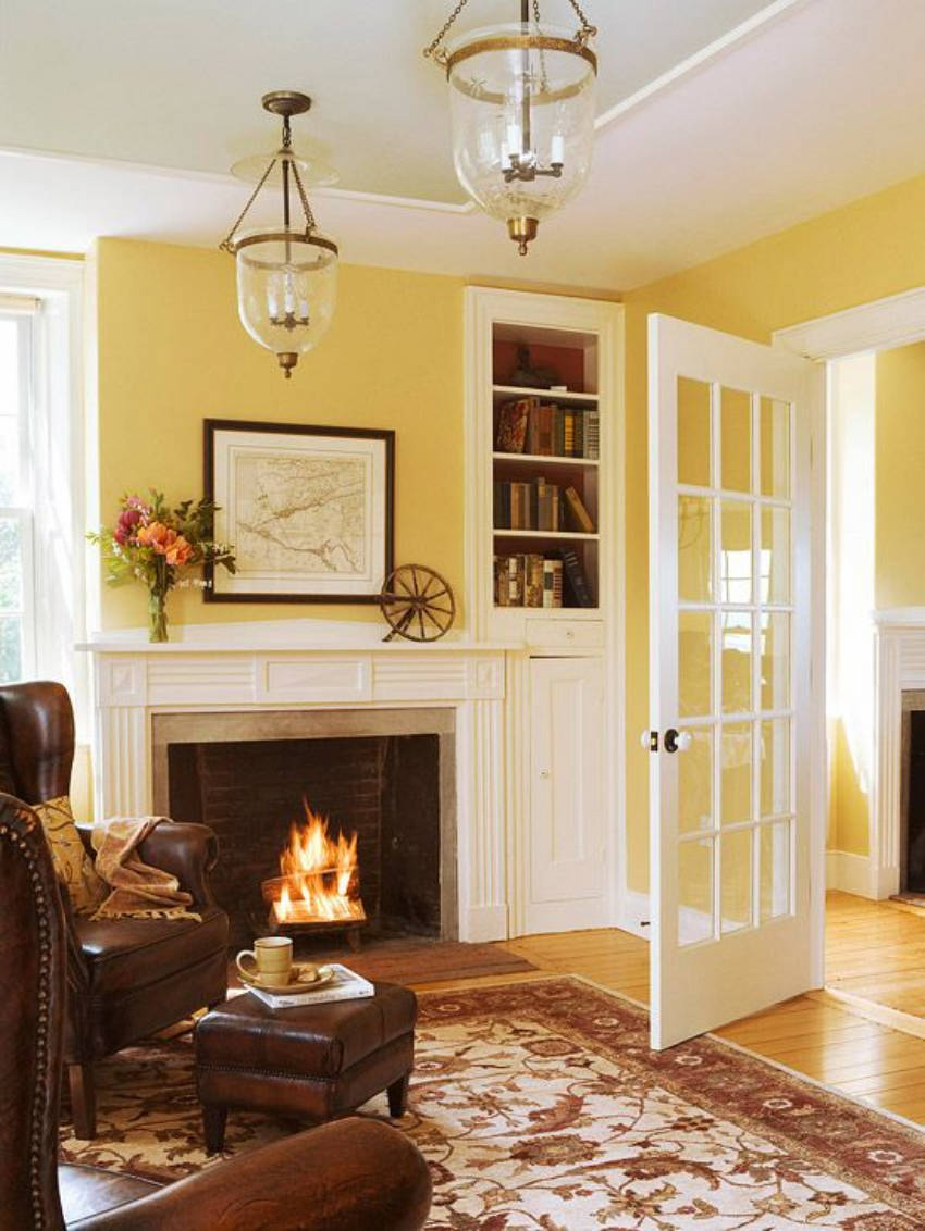
Nothing says spring more than a bright sunny look, and this is what we’re going for here! Yellow can be very aggressive, but pick a lighter hue and voilá - you have a soothing look reminiscent of sunny days without actually burning your eyes.
Related: 13 Amazing Ideas To Make Your Kitchen More Colorful
Coral Pink
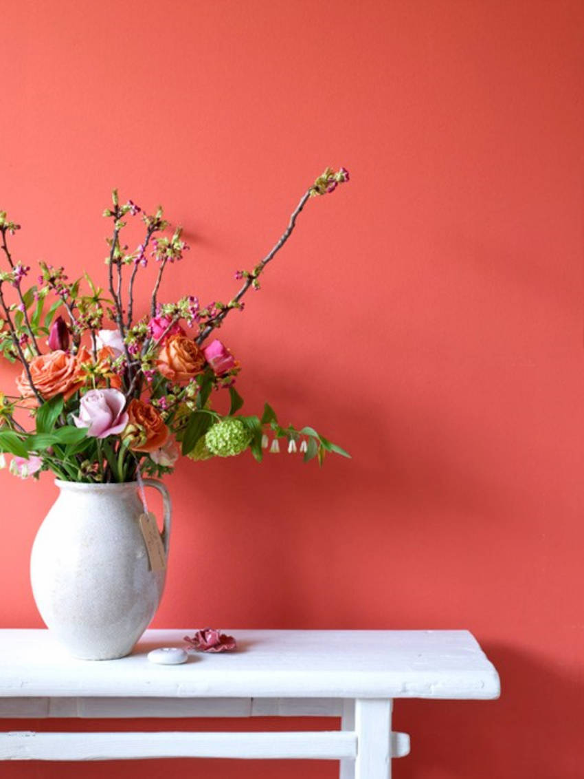
Not everything has to be light; we also have room for bolder tones! The great thing about this coral pink though, is that it’s a strong color, but still easy on the eyes. You certainly don’t want your walls to be glitter pink, but coral pink is the perfect balance for a spring-like look!
Related: Pantone’s Top 10 Spring 2017 Colors
Follow us on Facebook! We are always posting articles to help you with home improvement, whether it’s redecorating, repainting, DIY-ing, or starting from scratch!
